Back to main
Back to main
Next Project
Next Project
SchlemmerButler
Schlemmerbutler
"SchlemmerButler" is an app for easy ordering and payment at restaurants in Germany. In this case study, I'll describe how I built the project from the ground up.
"SchlemmerButler" is an app for easy ordering and payment at restaurants in Germany. In this case study,
I'll describe how I built the project from the ground up.
👩💻 My Role: Senior Product Designer
💼 Product: in-house, Start-up, Delivery
🤩 Team: 22 Members
About the project
About the project
Our client, who owns 10,000 restaurants across Germany, approached us with the idea to create a delivery and pick-up app for his restaurants. The app is especially focused on smaller cities in Germany, like Heidelberg. According to the client, the main problem was that after COVID-19, many waiters left the industry, and it has been difficult to bring them back. As a result, customer service in the restaurants is suffering. To solve this, he wanted to create a delivery app that would help him manage orders online.
Our client, who owns 10,000 restaurants across Germany, approached us with the idea to create a delivery and pick-up app for his restaurants. The app is especially focused on smaller cities in Germany, like Heidelberg. According to the client, the main problem was that after COVID-19, many waiters left the industry, and it has been difficult to bring them back. As a result, customer service in the restaurants is suffering. To solve this, he wanted to create a delivery app that would help him manage orders online.
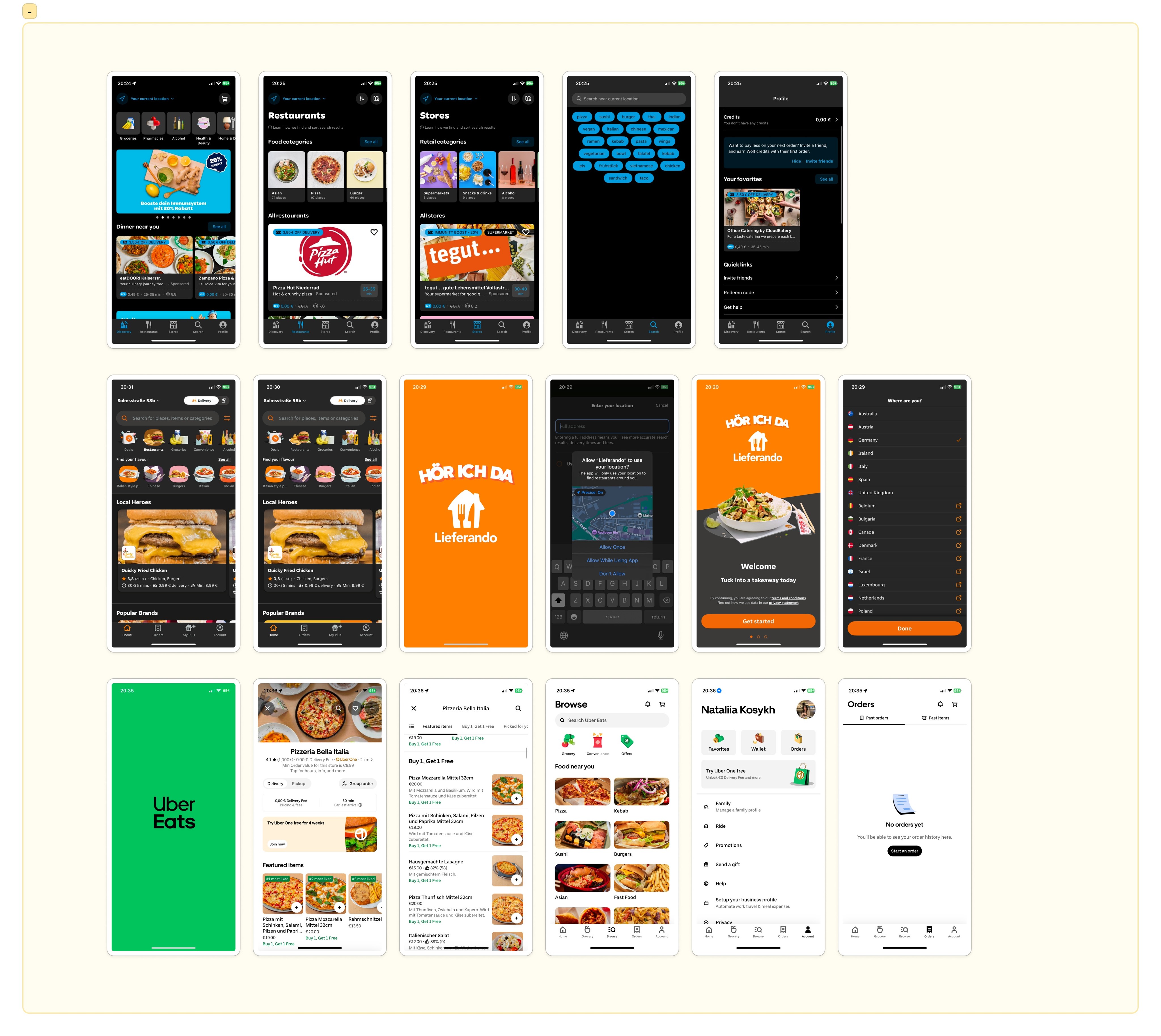
Competitive Analysis
Competitive Analysis
The food delivery industry was new to me, so the first step I took was analyzing the competition to better understand the market. The key competitors that have already set trends in Germany and are well-known among users are Wolt, Lieferando, UberEats, and Flink. I also looked into smaller players like Foodora, which are gaining popularity in specific regions. This analysis helped me identify the best practices and areas where we could differentiate SchlemmerButler.
The food delivery industry was new to me, so the first step I took was analyzing the competition to better understand the market. The key competitors that have already set trends in Germany and are well-known among users are Wolt, Lieferando, UberEats, and Flink. I also looked into smaller players like Foodora, which are gaining popularity in specific regions. This analysis helped me identify the best practices and areas where we could differentiate SchlemmerButler.
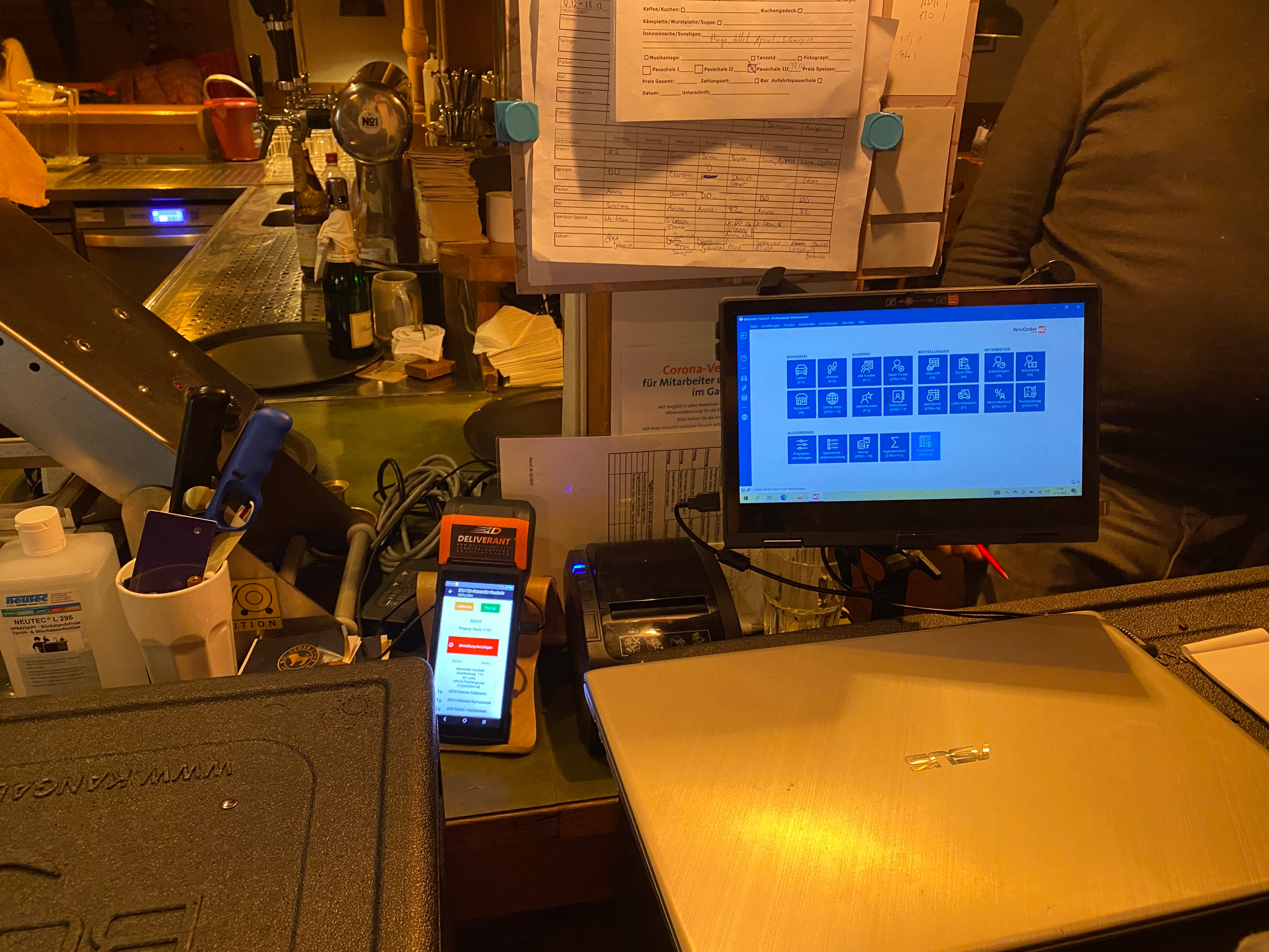
Field Research: Understanding Restaurant Operations
Field Research: Understanding Restaurant Operations
After completing the competitor analysis, I asked the stakeholders to organize a visit to one of their restaurants. I spent the entire day observing how the restaurant operates, focusing on how waiters interact with customers, the manager, and the kitchen, as well as how they use the order management system.
I noticed that, on average, a waiter spends about 7 minutes at each table. This hands-on experience helped me better understand the workflow and allowed me to start thinking about the user journey for the app.
To understand the client's problem,
I spent a day at their restaurant, talking to managers, waitstaff, and observing customers. This helped me see the real issue: the lack of staff in the restaurant. An app wouldn't solve this, as the restaurant still needs more personnel.
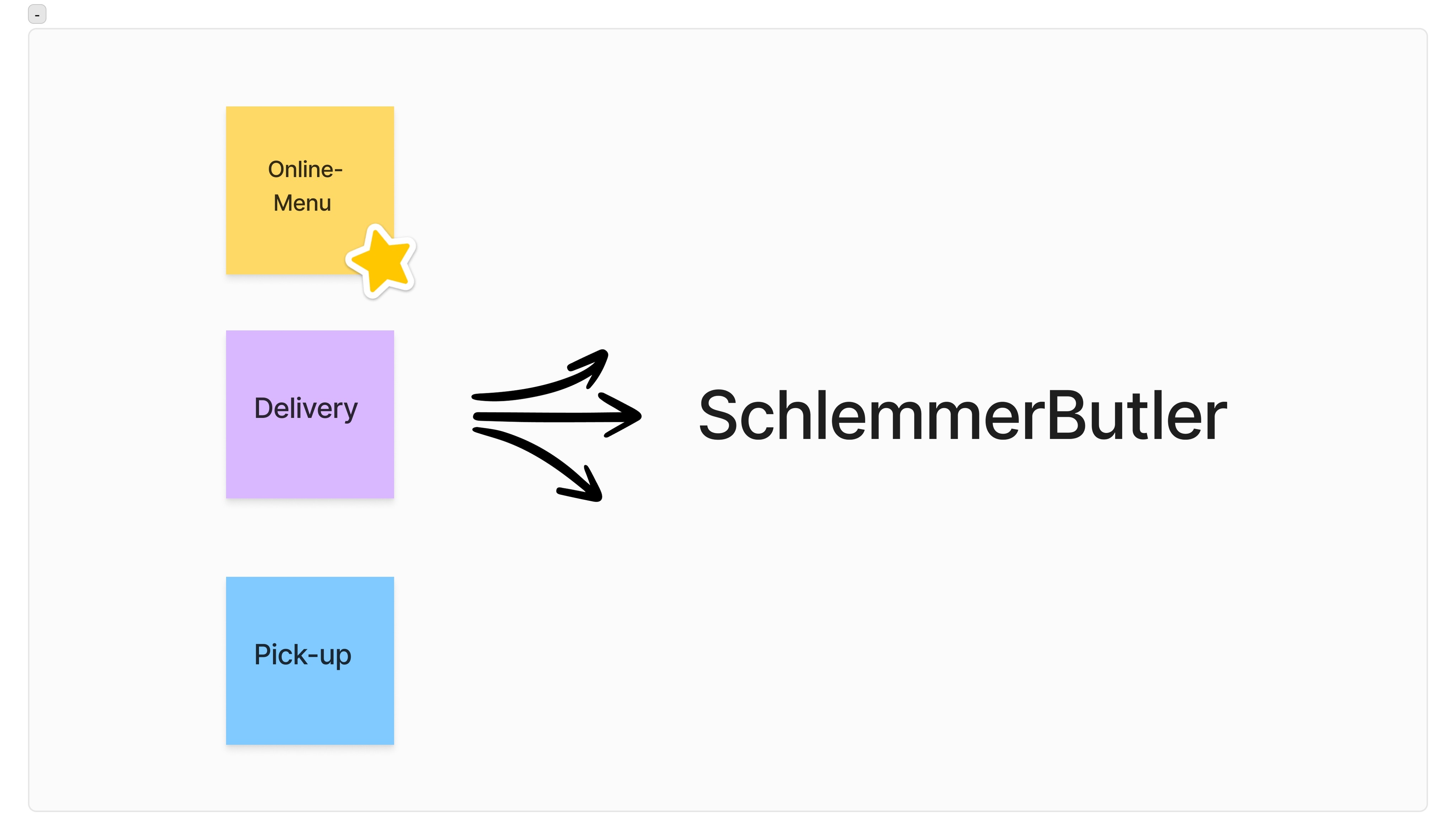
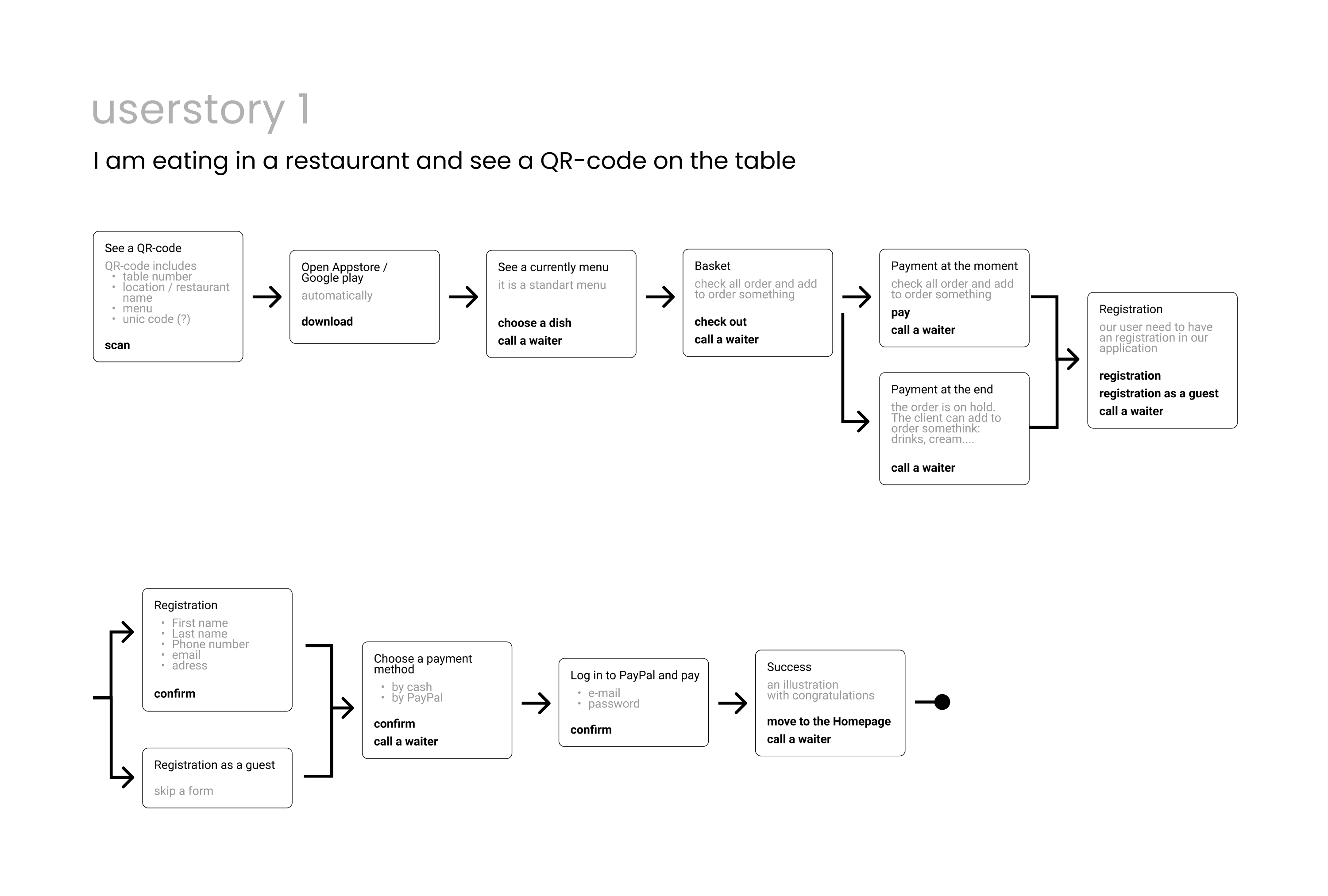
Problem Definition: Identifying the Key Challenges
Step 2: JTBD
and Wireframes
After my restaurant visit, I began brainstorming ideas and problems I observed during the research phase. I also applied the Jobs to be Done (JTBD) framework to gain a deeper understanding of the user's pain points.
It became clear that simply offering a delivery and pick-up service would not solve the client’s problem. Major players like Wolt and Lieferando already provide similar services, with massive marketing budgets behind them. Competing directly would not be profitable for our client at this stage. We needed a unique angle to stand out.
After discussions with the business, development, and design teams, we decided to create an online-menu that would improve customer service without hiring additional waitstaff. At the same time, we kept the client’s desire for delivery and pick-up features and combined them into one cohesive app.
After my restaurant visit, I began brainstorming ideas and problems
I observed during the research phase.
I also applied the Jobs to be Done (JTBD) framework to gain a deeper understanding of the user's pain points.
It became clear that simply offering
a delivery and pick-up service would not solve the client’s problem. Major players like Wolt and Lieferando already provide similar services, with massive marketing budgets behind them. Competing directly would not be profitable for our client at this stage. We needed a unique angle to stand out.
After discussions with the business, development, and design teams, we decided to create an online-menu that would improve customer service without hiring additional waitstaff. At the same time, we kept the client’s desire for delivery and pick-up features and combined them into one cohesive app.
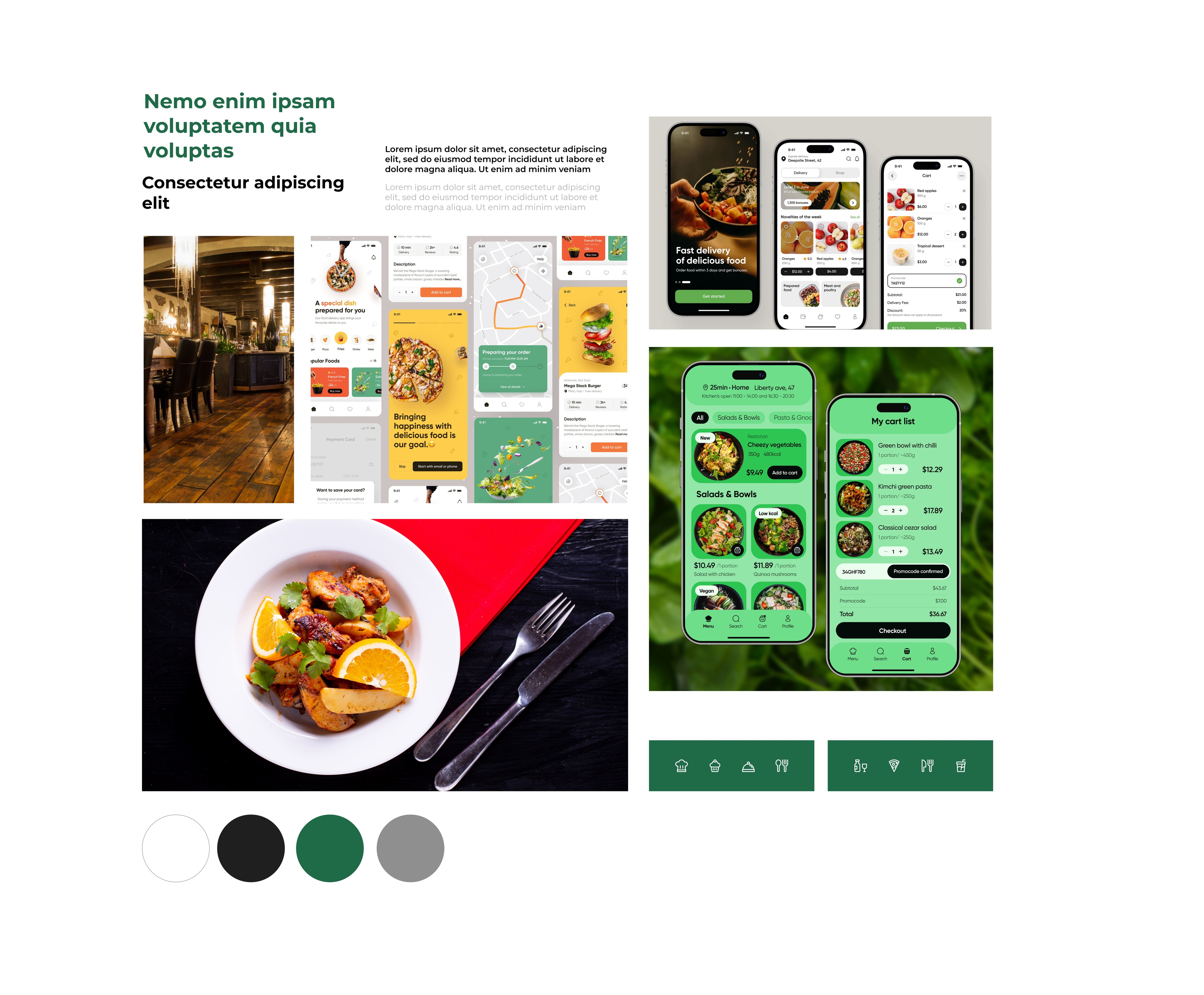
Step 1: Moodboard: Creating a Unified Vision
Step 1: Moodboard: Creating a Unified Vision
Step 1: Moodboard: Creating
a Unified Vision
TOur client had always worked with offline products, and none of the restaurants had a consistent style. My task was to design a visual concept that would work for all types of restaurants—from luxury dining to casual food spots. To achieve this, I chose dark, universal colors that fit both ends of the spectrum. I also aimed to create a softer look by incorporating rounded elements in the design. Additionally, I focused on using real photographs to showcase the beauty of the dishes, making the ordering process more appealing to users.
The client was exclusively offline.
In developing the app, I needed to craft
a brand vision that would apply both digitally and in offline spaces.
The screen shows the initial vision, which evolved through iterations and new insights.

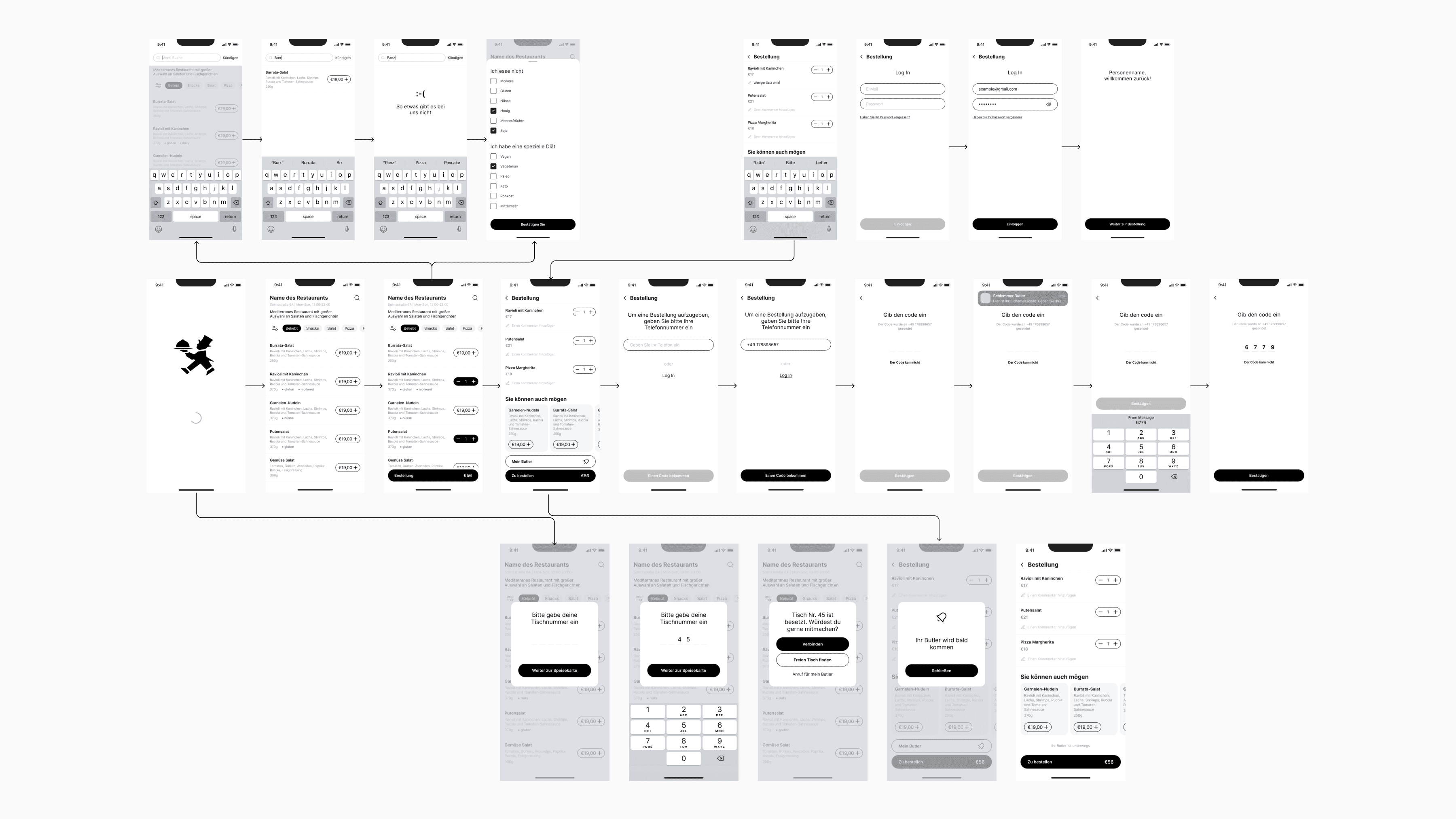
Step 2: Documentation and High-Fidelity Prototypes
Step 2: Documentation and High-Fidelity Prototypes
The client set a 6-month timeline for the entire project, giving us just 2 months for the design phase. I quickly began working on detailed black-and-white prototypes to better understand the user journey and flow. However, with limited time, it was essential to keep the development team engaged. Together with the second designer on our team, we split tasks and focused on both the user flows and the design system to ensure a smooth process for development.
After preparing the first color versions,
I developed hypotheses about UI decisions and user experience.
For example, I wanted to implement
a beautiful menu animation, but interviews revealed that such a menu hindered the ability to navigate back and place more orders, potentially affecting the client's revenue. Another hypothesis was about post-order payment in the app: it posed a risk of customers leaving without paying, yet traditionally, customers pay at the end of their visit in the restaurant. My interviews, conducted with black and white prototypes, helped address these concerns.
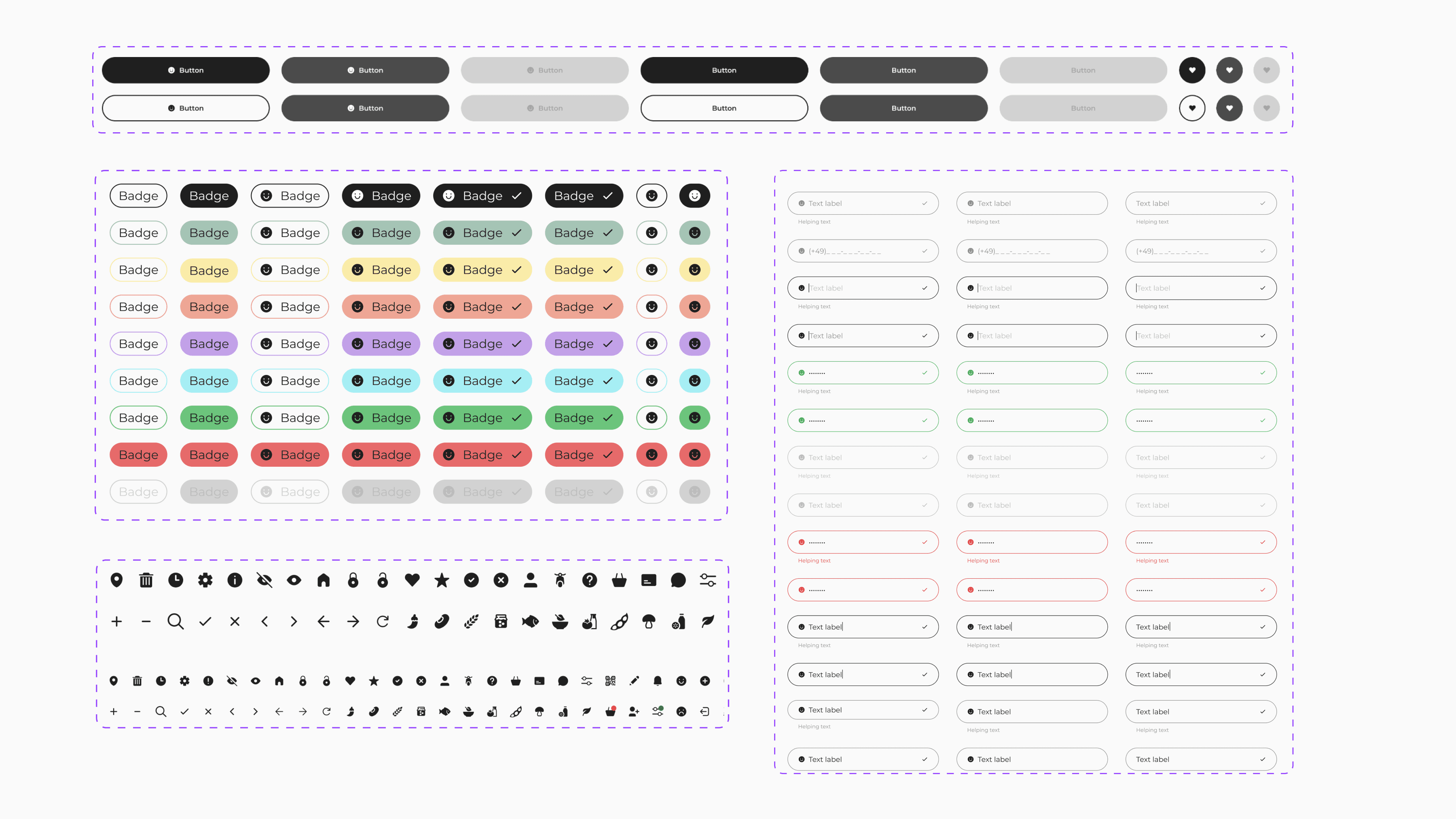
Step 3: Crafting the Design System
Step 3: Crafting the Design System
The design was created for two platforms, iOS and Android, with a dedicated development team for each. During the project, we crafted more than 30 unique components. Understanding that the user journey might change during development, I took a flexible yet secure approach. By following the Human Interface Guidelines for iOS and Material Design for Android, we ensured that we stayed on schedule while maintaining consistency across both platforms.
The project had a 6-month deadline for full development, with about 2 months allocated for designing the first MVP.
I started by creating a design system with components that allowed me to hand off components for development within the first few weeks of the project, while simultaneously assembling screens.
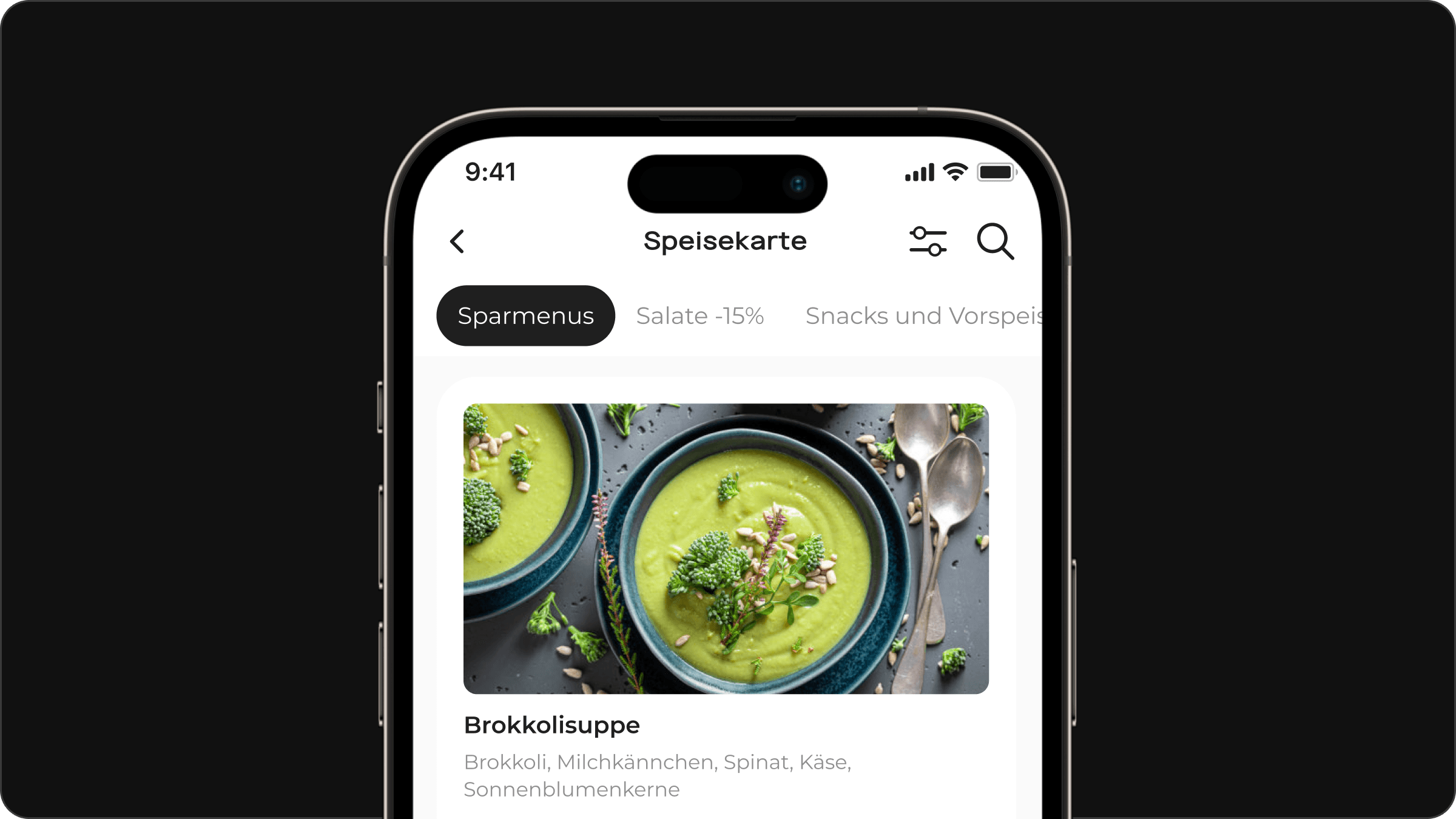
Step 4: Final Design
As a result, a complete project was developed from scratch for both iOS and Android, creating over 500 screens for the two platforms.
Result
The project's MVP has shown promising results, with tests successfully passed and more than 30 restaurants participating in trial versions, demonstrating a 90% success rate. Moreover, sales efforts have led to over 10 restaurants signing contracts for use, affirming the MVP's functionality. Qualitatively, the app's unique feature of calling waiters directly enhances customer satisfaction and sets us apart from competitors. Additionally, the redesign focusing on restaurant administrators' needs improves operational efficiency and communication, suggesting a positive impact on the dining experience and potential for revenue growth and scalability.
Step 4: Final Design
As a result, a complete project was developed from scratch for both iOS and Android, creating over 500 screens for the two platforms.
Result
The project's MVP has shown promising results, with tests successfully passed and more than 30 restaurants participating in trial versions, demonstrating a 90% success rate. Moreover, sales efforts have led to over 10 restaurants signing contracts for use, affirming the MVP's functionality. Qualitatively, the app's unique feature of calling waiters directly enhances customer satisfaction and sets us apart from competitors. Additionally, the redesign focusing on restaurant administrators' needs improves operational efficiency and communication, suggesting a positive impact on the dining experience and potential for revenue growth and scalability.