"Lenta is Russia's biggest grocery store chain. In this case study, I'll share how I developed a store delivery process during Covid and addressed user registration issues in the app.
👩💻 My Role: Product Designer
💼 Product: in-house, e-commerce
🤩 Team: 8 Members
In the end, a complete user flow was created for both iOS and Android. We did not release the MVP for the website because we needed to review and work on error cases.
After identifying the main problems and brainstorming with the team,
I started creating high-fidelity black and white prototypes to better focus on the user journey and not miss important points.
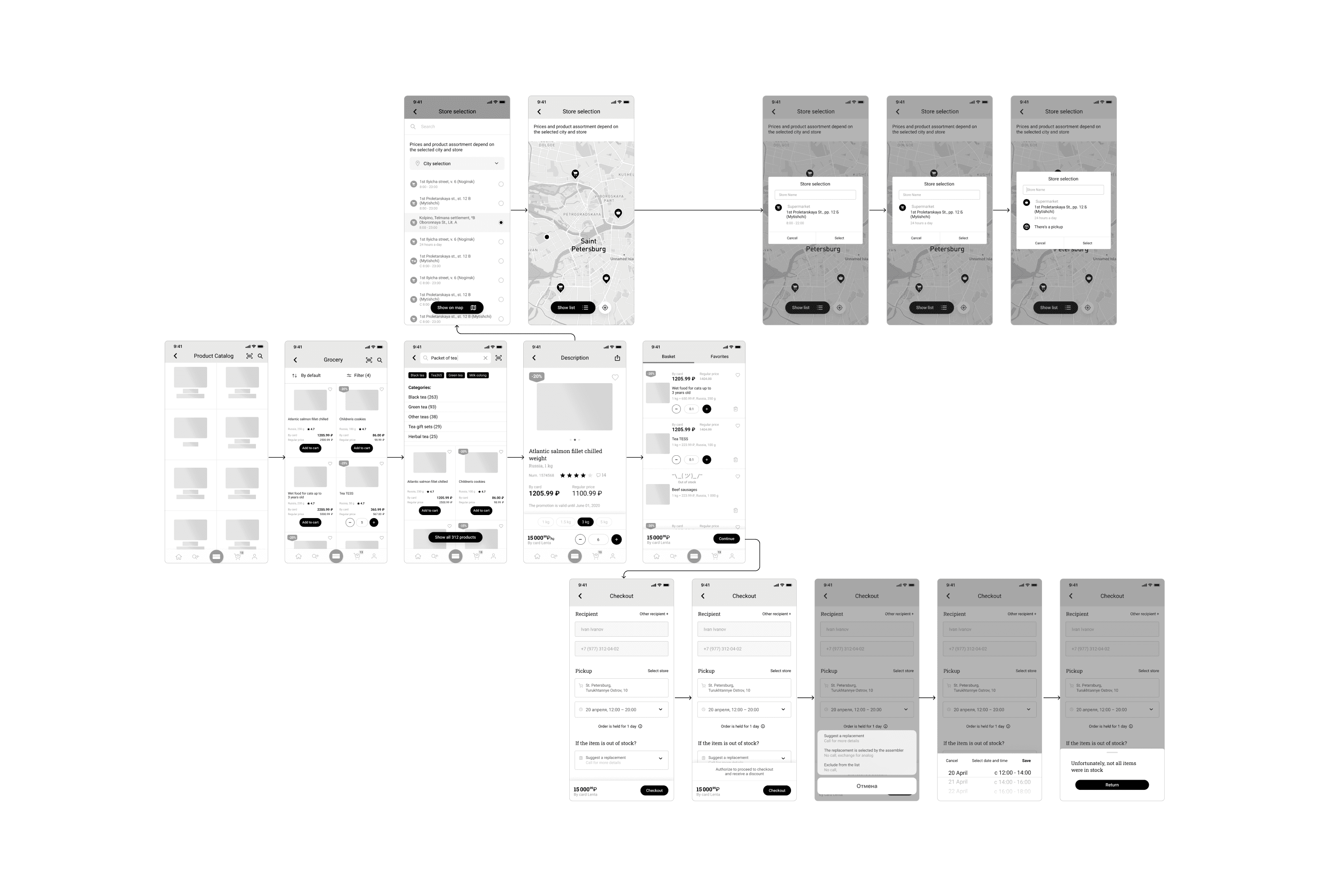
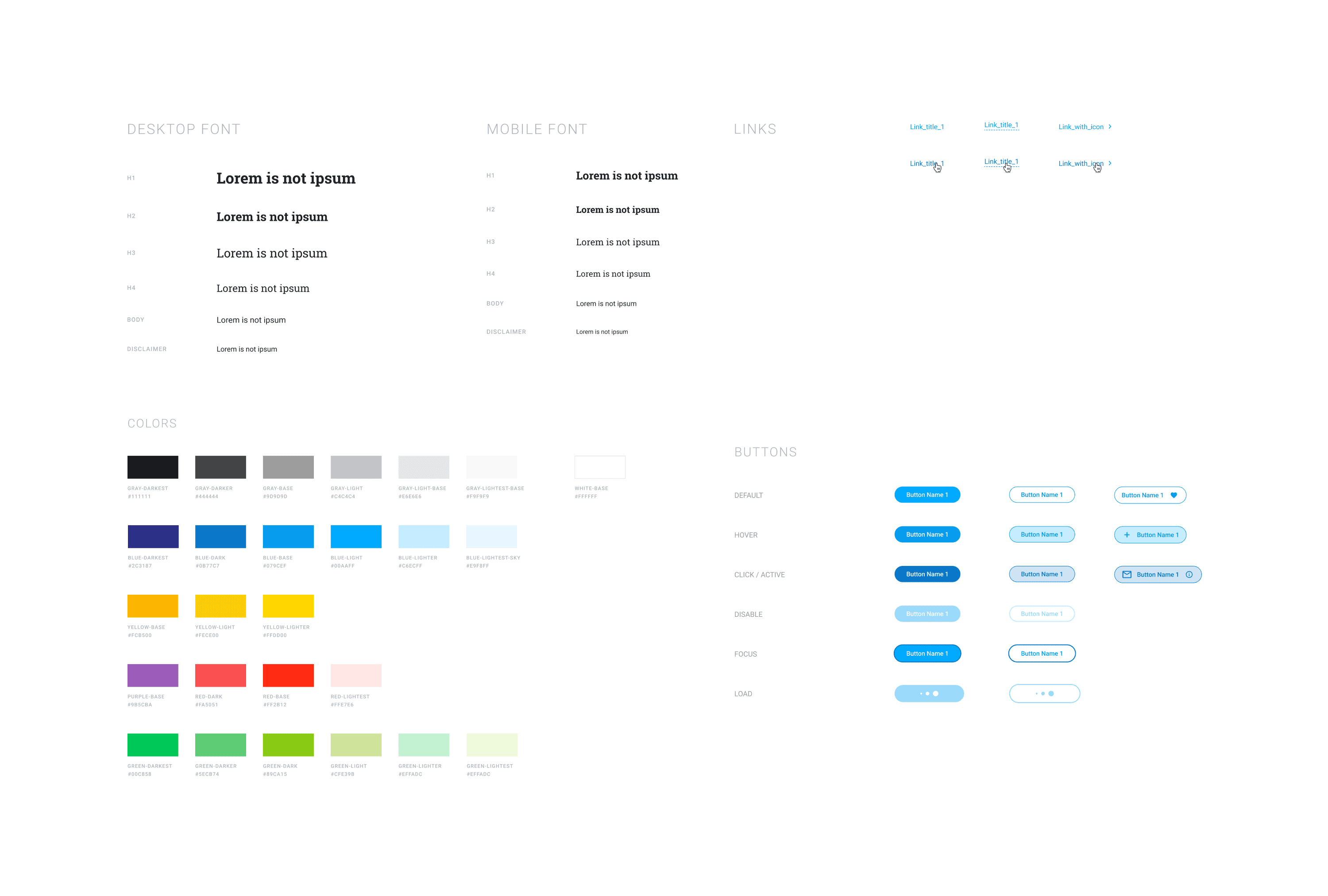
In Lenta, I used an existing design system, which helped quickly assemble layouts and hand them over for development. Since the user journey was new, many elements required review and refinement. Therefore, I also worked on creating more than 15 new components.
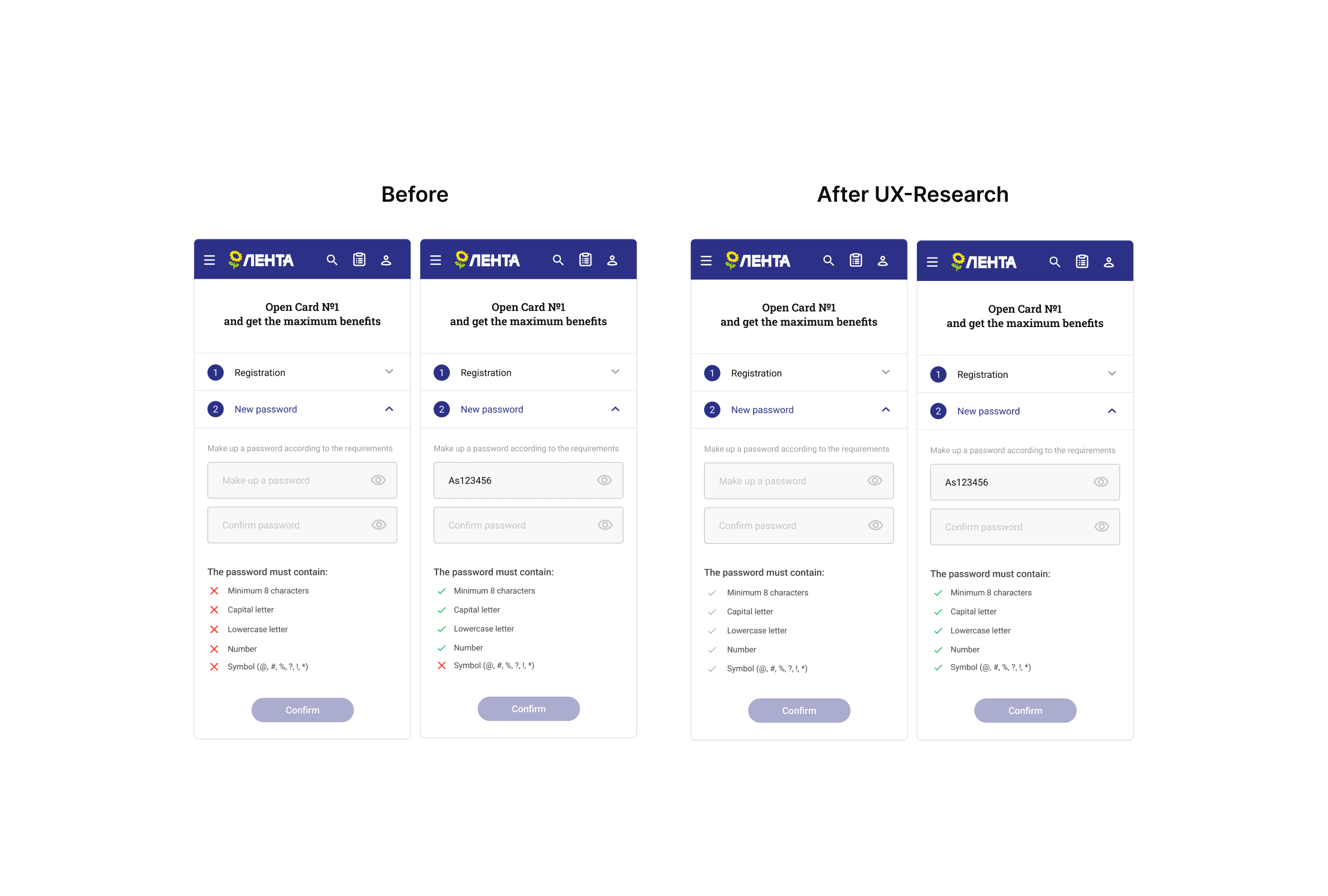
Problem in Registration
While developing the new user journey, I noticed another issue with registration: over 20% of users dropped off during password creation. Through interviews, I found they struggled with the need for a complex password. Despite discussing it with the security team, they didn't alter the requirements. Further investigation revealed interface communication also confused users.
Solution
Users misunderstood the error icon ❌ (shown below) as a sign not
to use the character, resulting in all characters being deemed invalid.
Resolution: I replaced the error icon with a disabled checkmark, which activated as users entered their password.
Result: This simple adjustment decreased failed registrations to 10%.
Research added updated registration with a new loyalty card to the new flow with delivery. Below I will show the web interface and its adapter, since the screens were developed for both the application and web.